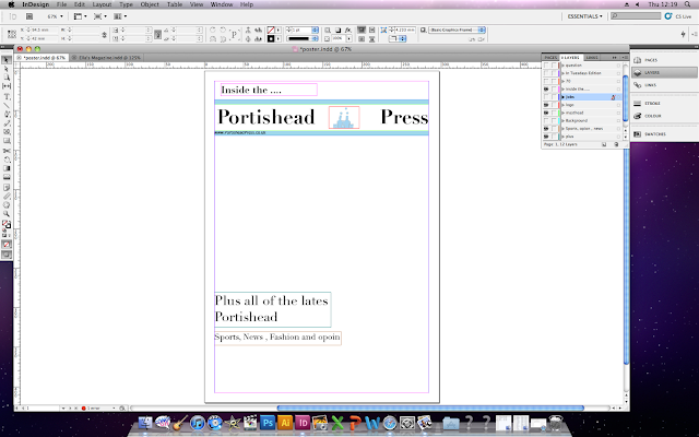
For my first design I decided that there were some key features that i would need to include such as the masthead of my newspaper 'Portishead Press' so individuals are aware of the brand which is being advertised.
For the idea of my poster i decided to use the unique selling point of this particular issue of Portidheads Press, this was the fact that they were advertising a wide range of jobs in the newspaper so i am going to use this to promote my newspaper.
Constructing My Poster
I started my newspaper poster by selecting a new A4 page on the computer program Indesign, i then created a layer named background, for this i wanted to make the background white so i used the square shaped tool to create a box over the area i wished and coloured it in white.
After creating the background i had to figure out a way to incorporate my masthead from my newspaper because from my research i discovered that all newspaper posters include their masthead, in the same formate as displayed on my newspaper. For this i created a new layer in which i imported the same masthead as my newspaper, i moved it around the page until i found a position that i thought suited it.
Along with imitating my masthead i also included the same logo that is featured on my health promotion campaign, for this i also created a new layer and name it 'Logo' i then placed it in the same area of between my masthead as shown on my newspaper, these will help for the people to be aware that it is the 'Portishead Press' advertising.
I thought that it looked to much like a document piece of writing, so i need to add some colour and shape to make the poster look more informal. To solve this problem i simple a rectangle tool to create two long lines, to fit it into my theme of my newspaper i used the same colour scheme of pale blue.
To show my technological convergence i displayed the website for my newspaper so the customers are able to interact with one another through there similarities.
I then added some writing, to begin with i placed 'Inside the...' above the masthead so people were clear that the poster doesn't provide all of these factors the newspaper will. I then placed other factors that the newspaper will include such as sport and fashion. To do this i created a new layer and inserted a text box on to the position of my choice, and simply used the font tool to pick a font of my choice. With this font i changed the hight of the letters so they are higher to match the theme of my masthead font.
I then wanted to put a statement that would make it obvious to the reader that the Portishead Press is offering a range of job opportunities in their local newspaper, for this it had to be clear however not to direct because from my research i found that posters seem to include a rhetorical question.
Ideas
For my ideas i wasn't sure what to go with so i asked some individuals that read local newspapers of questions that would take their attention and make them think about their job.
- Looking for a change ?
- Moving up the career ladder ?
- Need a change in direction ?
I then wanted to make it very clear that my newspaper was advertising a wide range of jobs not just the average 9 to 5 jobs, so people were not put of by the thought of lodes of jobs that they don't like and is similar to the job that they have already got.
I then looked back at my research and discovered that a majority of posters don't include numbers and only letters therefore i had to change 100's to Hundreds, also i add the information of in tuesdays
edition so the reader doesn't believe that these jobs are in every offer.
I then added the images of individuals going up a step to relate to my phrase 'moving up the career ladder?' however when i carried out some audience research into the design of my poster, it was obvious that their was one main factor that my target audience didn't like. This was the images they thought that they looked cheap and could not see the relation between the statement and the images.
This made me examine my poster and i could see what my audience were talking about, so to correct it i used the same image as i used to advertise the jobs on my newspaper. I used the gradient tool on indesign to make the image fade at the bottom. I accomplished this by adding a new layer then sending it to the back of my poster, the i have to create a shape on top of the image then use the gradient tool to draw a line of were i wish the image to fade.


No comments:
Post a Comment