I developed the normal forms of a local newspaper by creating my adverts, although this is the most creative area of a newspaper, i feel that i was a lot more creative with my adverts than a normal newspaper due to the amount of colour and range of fonts i use, this has more of an magazine feel , i think this works well because it brights the page up in hope to attract a larger audience
How effective is the combination of your media product and ancillary tasks ?
For my media production i created a local newspaper for portishead, the ancillary tasks that i created along with this newspaper was a poster and a radio advert.
The poster i created advertises the unique selling point of my newspaper, which is the idea that this issue of the portishead press will provide their readers with the opportunity to get a new job.
I kept the poster the same as my newspaper because it enables the reader to identify that the poster is supporting the portishead press not any newspaper. I tried to achieve this by keeping some similar elements from my newspaper such as the same font that i used on my front page which is distinctive because i edited the font ,and the same image from my newspaper advert because my audience is age between 35-45. These help the reader to identify that it is the portishead press that is providing their readers with job opportunities.
My radio advert supports my newspaper because it provides the audience
How did you use media technologies in the construction, research,planning and evaluation stages?
I used media technology through out the whole process of creating my newspaper, while in the research and planning stage i used blogger to record all my research so when in my planning stage i could go back and see the normal conventions of a local newspaper.
Also while in my planning stage i used the software 'micro soft publisher ' which is similar to indesign to create a page layout and discover wether all my elements would fit in to the space available. I was able to do this by creating boxes and placing them in the poisoned that i wished, then rearranging them.
While in the construction stage i used indesign to create my newspaper, this is a professional software that enabled me to be able to have different layers on my newspaper, which means it was easy for me to move items of my newspaper around the page to find a style that i thought would match my audience. While constructing in indesign i came across an issue of my text going over an image therefore to prevent this issue i decided to go on a challenge of text wrapping my story around the image. I had never done this before, so i had to use the web searcher of google to get a tutorial on youtube that described me how to do this on indesign, therefore i followed their instructions.
So for this i had to create a new layer and place my image on this, then i had to create a new layer and place my article on this layer. After positioning my layers i then had to create a new layer and draw a shape around the text, then send the layer to the back and merge the layers together. This then wraps the text around the image so non of the text or image cover each other.
In the construction stage of my poster i recyled the image from my newspaper however to be creative with the image i decided to add a fade out effect to the image. I was able to do this by creating a new layer and placing the image on this layer, i then had to create a new layer and place a square on top of my image, then swap the layers so the image is on the top. I then had to use the gradtent tool , when selecting the square layer and mark out were i wish the image to start to fade or to be clear, then by merging the two layer together i was able to fade the image out.
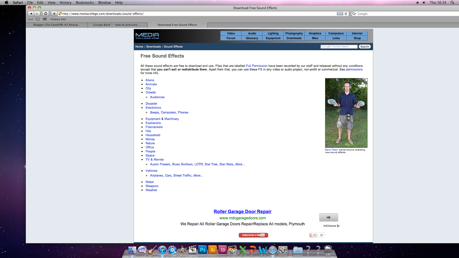
The other ancillary task i carried out was radio advert which i constructed in garge band, to get my sound effects i had to go on a free download website, import these to itunes then import these into garge band, then to get my voives i simply added a new layer and talked into the micro phone then edited them.
In my evaluation i have used the media technology of imove that has enable me to be able to audio film myself then place images of real local newspapers or screen shots of my local newspaper over the image of me speaking.
Tuesday, 29 January 2013

Thursday, 24 January 2013
Construction of radio advert
To construct my radio advert i used the software of gargeband which is on the school computers, i never used this soft ware before however it was fairly easy to operate .
I made this by searching for the desired sound effects on google, this enabled me to chose sounds that would set the scene such as alarm clock, car driving and a car door.


Evaluation
For my evaluation i have decided to use a different formate of media to present my responses, so i have chosen to do a audio record of my voice in imovie then uses images over the audio such as images of google but also screen shots from the construction of my newspaper.
Writing Answers
Question 1: In what way does your media product,use, develop or challenge forms and conventions of a real media product?
Use- traditional layout , margins, writing style
develop-
challenge- My adverts were more colourful
Question 4: How did you use media technologies in the construction, research, planning and evaluation stage ?
At the start of this process i was unfamiliar with local newspapers due to using other areas of media to find out information therefore i had to carry out extensive research and for this i used the web searcher 'google' this technology was very helpful to me because it allowed me to be able to identify the normal conventions of local newspapers.
During my planning for my local newspaper i used the social network site of Facebook to organise my models who were going to be in my images, this allowed me to have effective time while with my models. I simple would send them a message asking them if they were free at a certain time, and explain what they would be doing. This was especially important because of the dark afternoons, because i needed bright lighting.
Also while in the planning stage i used the software of 'indesign' this enabled me to be able to make a plan of the layout of the newspaper, i done this by creating a new page
Tuesday, 22 January 2013
Constructing My Advert
Radio Advert
To begin my radio advert i downloaded the software of http://audacity.sourceforge.net/ that had been advice to use for creating a radio advert, however i have never attempted to make a radio advert and have no idea therefore i used youtube to watch how it is created.
Unfortunately i spent a few hours trying to figure out how to create a radio advert on this software but i was unable to do this, so i have decided to use garage band instead. Which i have no experience in but is whilling to give it ago.
Monday, 7 January 2013
Radio Advert
After conducting the analysis i have discovered the normal conventions of a radio advert and and a newspaper television advert, therefore for my newspapers radio advert i am going to mix them together.
Planning
Aim of the advert
My first aim is to display all of the opportunities in occupations that Portishead Press are providing their readers with.
My other aim to show that the newspaper is a relaxing experience and provided you with knowledge.
Idea 1
My first idea is to include typical noises that would be heard when an individual is getting ready for work. After you hearing them rushing their is a rewinding noise that takes the individual back to the start of the day when they sit down and read and they read the portishead press.
Noises that could be included
Planning
Aim of the advert
My first aim is to display all of the opportunities in occupations that Portishead Press are providing their readers with.
My other aim to show that the newspaper is a relaxing experience and provided you with knowledge.
Idea 1
My first idea is to include typical noises that would be heard when an individual is getting ready for work. After you hearing them rushing their is a rewinding noise that takes the individual back to the start of the day when they sit down and read and they read the portishead press.
Noises that could be included
- Alarm Clock
- Kettle
- Toaster
- Car Engin
- Horn
My second idea is that an individual steps into work and their boss asks them about a topic related to their job that has been in the news recently. The worker is clueless and the boss isn't impressed that the individual isn't doing external reading into the area of work. Then it rewinds and the worker starts his day again but this time they read the Portishead Press and find about about the topic, then when the boss ask the worker is full of ideas about the topic.
Idea 3
My third idea is that an individual gets up to go to work isn't happy about it, doesn't enjoy their job, then when they read the Portishead Press they find the perfect job that they had been hoping for.
Audience Feedback
Kayla- 'My preferred idea is number 2 because it is quite detailed and it provides you with the confidence that the newspaper will benefit you in some way.'
Harrit- 'I think that the nosies from idea 1 would make the newspaper advert sound more interesting, and would relate to your audience because they would be of the age were they do have jobs.
Sasja- ' The second idea is the best for me because it suggests that the newspaper would be worth the time reading'
Holly- 'The second and third are more helpful for showing the unique selling point of the newspaper of providing lots of jobs.'
With my audiences feedback in mind i have decided to go on with idea 2 because it was the most popular among the age ranges. However i am slightly going to change it to incorporate some of the noises from idea number 1 other wise their wont be any music in my advert which would be breaking the conventions of a real radio advert.
Script Idea 1
Sound of alarm
Sound of shower
Sound of door
Sound of car engine
Sound of lift opening
Morning Paul (boss)
Morning Jake (worker)
So i am interested to hear about your views on the issue of recycling bins (boss)
We are saving the next generation of people with minimal effort.(worker)
Paul, you haven't heard about the article in the Portishead Press, what happened to you external research ?(boss)
Huh? (worker)
Rewinding noise
Portishead Press Provides You With All Your Daily Knowledge (another voice)
Script Idea 2
Sound of alarm
Sound of car engine
Sound of lift opening
Morning Paul(boss)
Morning Jake(worker)
So i am interested to hear about your views on the issues of recycling bins (boss)
Mmmm... it helps the world last longer (worker)
Paul, your useless....(boss)
Rewinding noise
Portishead Press provides you with the knowledge needed to be prepare for your day.
Script Idea 3
Sound of the alarm
Sound of car engine
Sound of car door opening
Morning ella (boss)
Morning Harriet (worker)
So i am interested to hear about your views on the issues of recycling bins (boss)
Well my view on recycling bins is.......fade out
fade in.. wow how do you know this much (boss)
i read the portsiehead press (worker)
Portishead press helping you stay ahead with all your local news (voice of newspaper)
Script Idea 1
Sound of alarm
Sound of shower
Sound of door
Sound of car engine
Sound of lift opening
Morning Paul (boss)
Morning Jake (worker)
So i am interested to hear about your views on the issue of recycling bins (boss)
We are saving the next generation of people with minimal effort.(worker)
Paul, you haven't heard about the article in the Portishead Press, what happened to you external research ?(boss)
Huh? (worker)
Rewinding noise
Portishead Press Provides You With All Your Daily Knowledge (another voice)
Script Idea 2
Sound of alarm
Sound of car engine
Sound of lift opening
Morning Paul(boss)
Morning Jake(worker)
So i am interested to hear about your views on the issues of recycling bins (boss)
Mmmm... it helps the world last longer (worker)
Paul, your useless....(boss)
Rewinding noise
Portishead Press provides you with the knowledge needed to be prepare for your day.
Script Idea 3
Sound of the alarm
Sound of car engine
Sound of car door opening
Morning ella (boss)
Morning Harriet (worker)
So i am interested to hear about your views on the issues of recycling bins (boss)
Well my view on recycling bins is.......fade out
fade in.. wow how do you know this much (boss)
i read the portsiehead press (worker)
Portishead press helping you stay ahead with all your local news (voice of newspaper)
Radio Advert
To begin my newspaper advert i first looked into researching newspaper adverts to see what connventions were normal for a newspaper advert, however while investigating i could not seem to find a single newspaper advert not even for nation or global newspapers such as news of the world.
Although, after visting http://www.radioville.co.uk/ and listening to some of the radio adverts they have produced has given me some idea of normal conventions of a radio advert.
Analysis
From investigating these radio adverts it has given me an idea of what i need to include such as a strong accent and an a simple script that informs individuals of the reason why an individual would by the Portishead Press.
To get an isight in to what type of information a real newspaper would want to include i took the time to analysis a recent advert by the Sun although this isn't a local newspaper it does provide me with an insight into what an newspaper would wish to promote about their newspaper.
In this advert they have got a young girl roughly around the age of 6, for the whole advert the girl is sing about the things that are wrong with January such as the weather, no money, going back to work and weight gain. Then at the end of the advert they inform the reader about the point of the advert which is a chance of winning a range of free holidays which can solve a few of the issues that were mentioned.
Saturday, 5 January 2013
Questionnaire
After choosing my idea for my newspaper poster, i wanted to carry out some audience research to see the types of jobs that my target audience would be intrested in. For this i carryed out a small scale queationnaire that i include some open and closed questions, so i could be informed about the types of jobs the readers would wish to be invloved leading to them to buy my newspaper.
The first question i asked my sample was which genda they were to help identify which type of gender i should include in my images.
This bar chart suggest that out my small sample of 18 individuals their was an response of 10 males and 8 females. I did send out more questionnaires however their was only have the amount that provided feedback, anyway this shows that my sample were fairly equal with the genda therefore i will be including a mixture of genda in my images for my poster.
The next querry i had was to discover the occupation of my sample to help me see what jobs i should be advertising are included in the newspaper.
From the pie chart i can identify four main sections that my samples jobs fit into business such as construction manager, adiminastrater, graphic desinger and making microsoft software. Care sector such as care work, dentail nurse and teacher assisent, labour which constited of a gaderner, carpanteer lastly there was the section that did not have an occupation due to either being a house wife or retired.
The last question i asked my sample was which job would they be carrying out in their ideal world to discover which type of occupation they would be looking to take up.
This pie chart suggest that they were roughly the same sectors as before however there has been an addded sector of personal fittness.
The first question i asked my sample was which genda they were to help identify which type of gender i should include in my images.
This bar chart suggest that out my small sample of 18 individuals their was an response of 10 males and 8 females. I did send out more questionnaires however their was only have the amount that provided feedback, anyway this shows that my sample were fairly equal with the genda therefore i will be including a mixture of genda in my images for my poster.
The next querry i had was to discover the occupation of my sample to help me see what jobs i should be advertising are included in the newspaper.
From the pie chart i can identify four main sections that my samples jobs fit into business such as construction manager, adiminastrater, graphic desinger and making microsoft software. Care sector such as care work, dentail nurse and teacher assisent, labour which constited of a gaderner, carpanteer lastly there was the section that did not have an occupation due to either being a house wife or retired.
The last question i asked my sample was which job would they be carrying out in their ideal world to discover which type of occupation they would be looking to take up.
This pie chart suggest that they were roughly the same sectors as before however there has been an addded sector of personal fittness.
Designs For Poster
For my poster i have conducted some research into newspaper posters that exist however i found it difficult to find newspaper posters therefore i do not have much to base my newspaper poster design on.
For my first design I decided that there were some key features that i would need to include such as the masthead of my newspaper 'Portishead Press' so individuals are aware of the brand which is being advertised.
For the idea of my poster i decided to use the unique selling point of this particular issue of Portidheads Press, this was the fact that they were advertising a wide range of jobs in the newspaper so i am going to use this to promote my newspaper.
Constructing My Poster
I started my newspaper poster by selecting a new A4 page on the computer program Indesign, i then created a layer named background, for this i wanted to make the background white so i used the square shaped tool to create a box over the area i wished and coloured it in white.
After creating the background i had to figure out a way to incorporate my masthead from my newspaper because from my research i discovered that all newspaper posters include their masthead, in the same formate as displayed on my newspaper. For this i created a new layer in which i imported the same masthead as my newspaper, i moved it around the page until i found a position that i thought suited it.
Along with imitating my masthead i also included the same logo that is featured on my health promotion campaign, for this i also created a new layer and name it 'Logo' i then placed it in the same area of between my masthead as shown on my newspaper, these will help for the people to be aware that it is the 'Portishead Press' advertising.
I thought that it looked to much like a document piece of writing, so i need to add some colour and shape to make the poster look more informal. To solve this problem i simple a rectangle tool to create two long lines, to fit it into my theme of my newspaper i used the same colour scheme of pale blue.
To show my technological convergence i displayed the website for my newspaper so the customers are able to interact with one another through there similarities.

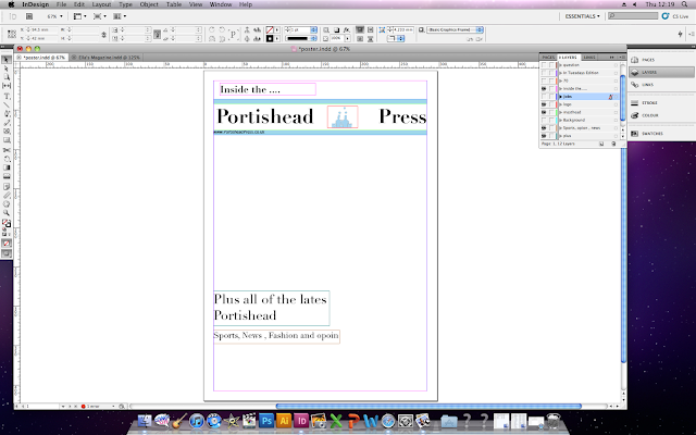


I then looked back at my research and discovered that a majority of posters don't include numbers and only letters therefore i had to change 100's to Hundreds, also i add the information of in tuesdays
edition so the reader doesn't believe that these jobs are in every offer.


This made me examine my poster and i could see what my audience were talking about, so to correct it i used the same image as i used to advertise the jobs on my newspaper. I used the gradient tool on indesign to make the image fade at the bottom. I accomplished this by adding a new layer then sending it to the back of my poster, the i have to create a shape on top of the image then use the gradient tool to draw a line of were i wish the image to fade.

For my first design I decided that there were some key features that i would need to include such as the masthead of my newspaper 'Portishead Press' so individuals are aware of the brand which is being advertised.
For the idea of my poster i decided to use the unique selling point of this particular issue of Portidheads Press, this was the fact that they were advertising a wide range of jobs in the newspaper so i am going to use this to promote my newspaper.
Constructing My Poster
I started my newspaper poster by selecting a new A4 page on the computer program Indesign, i then created a layer named background, for this i wanted to make the background white so i used the square shaped tool to create a box over the area i wished and coloured it in white.
After creating the background i had to figure out a way to incorporate my masthead from my newspaper because from my research i discovered that all newspaper posters include their masthead, in the same formate as displayed on my newspaper. For this i created a new layer in which i imported the same masthead as my newspaper, i moved it around the page until i found a position that i thought suited it.
Along with imitating my masthead i also included the same logo that is featured on my health promotion campaign, for this i also created a new layer and name it 'Logo' i then placed it in the same area of between my masthead as shown on my newspaper, these will help for the people to be aware that it is the 'Portishead Press' advertising.
I thought that it looked to much like a document piece of writing, so i need to add some colour and shape to make the poster look more informal. To solve this problem i simple a rectangle tool to create two long lines, to fit it into my theme of my newspaper i used the same colour scheme of pale blue.
To show my technological convergence i displayed the website for my newspaper so the customers are able to interact with one another through there similarities.

I then added some writing, to begin with i placed 'Inside the...' above the masthead so people were clear that the poster doesn't provide all of these factors the newspaper will. I then placed other factors that the newspaper will include such as sport and fashion. To do this i created a new layer and inserted a text box on to the position of my choice, and simply used the font tool to pick a font of my choice. With this font i changed the hight of the letters so they are higher to match the theme of my masthead font.

I then wanted to put a statement that would make it obvious to the reader that the Portishead Press is offering a range of job opportunities in their local newspaper, for this it had to be clear however not to direct because from my research i found that posters seem to include a rhetorical question.
Ideas
For my ideas i wasn't sure what to go with so i asked some individuals that read local newspapers of questions that would take their attention and make them think about their job.
- Looking for a change ?
- Moving up the career ladder ?
- Need a change in direction ?

I then wanted to make it very clear that my newspaper was advertising a wide range of jobs not just the average 9 to 5 jobs, so people were not put of by the thought of lodes of jobs that they don't like and is similar to the job that they have already got.

I then looked back at my research and discovered that a majority of posters don't include numbers and only letters therefore i had to change 100's to Hundreds, also i add the information of in tuesdays
edition so the reader doesn't believe that these jobs are in every offer.

I then added the images of individuals going up a step to relate to my phrase 'moving up the career ladder?' however when i carried out some audience research into the design of my poster, it was obvious that their was one main factor that my target audience didn't like. This was the images they thought that they looked cheap and could not see the relation between the statement and the images.

This made me examine my poster and i could see what my audience were talking about, so to correct it i used the same image as i used to advertise the jobs on my newspaper. I used the gradient tool on indesign to make the image fade at the bottom. I accomplished this by adding a new layer then sending it to the back of my poster, the i have to create a shape on top of the image then use the gradient tool to draw a line of were i wish the image to fade.

Thursday, 15 November 2012
Newspaper Billboard.
Newspaper Billboard

This is a newspaper poster to advertise the star newspaper, they have included the slogan that they put on the top of the newspaper in black bold writing. The image they have included is one of their own newspapers folded up in a paper aeroplane which relates to one of their cover lines ' support the RAF Oxford Air Show'.
Underneath the image they have included a sentence of what they included in their newspaper and the reason to buy the Star. Then they have got an image of their newspaper folded at the bottom so the reader can recognise the newspaper. They have used an silver background that washes out into a white background.

The Press is a local newspaper which has done a poster to advertise and raise awareness of the newspaper. At the top of the poster they have included the masthead that they use on their newspaper. They have also included the logo in the same position as they have in the newspaper. They have got a large image of candles which people associate with special occasions. They used this image because they are advertising the success of the press of being published for 150 years. In the background they have used a large image of a newspaper story and lightened the image were the candles are present.
At the very bottom they have included a joke and the companies name who comes up with these jokes that they have to produce a difficult joke on page 4 in each newspaper they produce.
They have also used an image of the printed copy of the newspaper to make the reader aware of what they are trying to advertise.

The metro is a local newspaper that have created a poster to advertise there product against competitors. The poster has an image that covers the whole background of a man in a suit that would be associated with business. In the image the business man is holding an purple book that appears to be an book that somebody of high intelligence would use on a regular bases. In side of the book they have slipped a folded up copy of their newspaper to suggest that these type of individuals are who them aim their newspaper at.
In the bottom right conner they have placed the website of the newspaper so individuals can learn more about the newspaper by going on to the website and they are displaying the companies use technological convergence.
The main text on the poster is the slogan 'Your dirty little secret....' which is included on each issue of the metro. For this slogan they have used the same type of font they use for their newspaper masthead this could be because that font is known by local people as the metro's font therefore when they see that font they know it is the metro.
Lastly they have placed their masthead 'metro' at the bottom left hand coroner in the same formate it would be displayed on the newspaper this is so people are aware of the brand that is advertising their newspaper.

The i newspaper have done two individuals posters that look very similar, the main image of the poster is the masthead of the newspaper 'i' which has been placed in the centre of the poster in a very well large font. They have also included their logo of a type of bird in the same formate as it is placed on the actual newspaper, they have also positioned it in the same place around the masthead as it is on the newspaper. This could be because they want to build up an audience that are aware of their newspaper. On the masthead they have included what they i offers individuals such as 'sport, opinion, ideas, jobs etc they have done this so people are aware of what they will receive for their money.
At the bottom right hand side they have included their slogan of 'it's a red letter day! i is all you need' this is also included in the front of the newspaper.

The metro have created another poster to advertise their newspaper however this time it has a more simple and informal feel towards the newspaper. They have placed a block colour of bright blue for the background. For the cover image they have used what seems to be a cartoon newspaper being opened. They have then added a red steps which are normally founded on the side of public swimming pools.
The way they have made the newspaper look like a swimming pool links to their main cover line of 'Dip IN' where they suggest that the metro have good content that their target audience would be able to pick up the metro and be able to read for a long time.
The colour scheme they have used for this poster is blue, red and white which is the same colour scheme for the newspaper itself this create continuity for the customer.
At the bottom the poster they have placed the masthead of the newspaper in the same font and colours, they have done this so the audience are aware that this advertisement is for the metro.
.jpg)
The metro have created another poster to advertise their newspaper however this time they have used an image of a women eating her breakfast however instead of her eating cereal in the image she is eating the words. This shows that she is eating knowledge that she will gain through reading the metro. They have used a background of plain cream and placed the women on top, the women is dressed in a natural clothes.
She has been positioned in a stance as if she is eating her breakfast, on the spoon they have put facts on as in she is going to digest them.
They have placed a slogan on the top left hand corner of 'news that will feed your mind' which matches with the cover image. The slogan is suggesting that the metro contains data that you will find useful in later life and you will find your knowledge being developed each time you read it. They have done the slogan in blocked capitals which makes the statement seem that it is a fact.
Wednesday, 7 November 2012
Image for advert
Hair Image
For this advert i knew i wanted to use an image of some hair that had been styled to make it clear what the advert was about. For this a picked a women who had short hair due to the space available with out the main writing going over the image.
I started by styling the hair to be down however my model had not had her hair dyed in while so she was revelling her brown roots. To correct this issue i put her hair up in a quiff which is the section of the front hair being back brushed then put back with a clip.

After solving this problem i then had the issue of a dark room because i made the image look very dark to get ride of this i put a artificial light over the camera when taking the image.

Then to get ride of the background by using the quick select tool and setting that as a new layer. After this i use the magic eraser tool and deleted the background.
I was left with a few bit of background therefore i used the eraser tool to get ride of these and also to neaten the image up. Then i made the background layer invisable so the white background was not there.
Tuesday, 6 November 2012
Dance Story
Dance Story
To create the dance story i looked at previous stories that have been in local newspapers such as the evening post about a man who has opened a skating park for children. This helped mw with the style of writing to include in this story.
I noticed from the primary research that i have carried out that in the first paragraph they include who,what,where,when and why. This is so the reader can get a summary of the story very quickly, due to this convention i have included these factors in my first paragraph as well.
Knife Story
Knife Story
In my planning i wanted to place my story on the right hand side however to fill in the space on top of my main story i have placed the headline from the knife story. I came up with the headline by looking through previous newspaper headlines. I noticed that if the story had already been in the newspaper and have a lot of media coverage are refereed to as the road were the incident occurred. Due to the i picked a road that eight letters so it would fit into the space that i made available for it. I then put the title into capital letters to show that it is an important story. Additionally i felt it help to make it clear that the title isn't matched with the image. The only problem i could come up with was that if people had not seen the issue or any media coverage about the stabbing they would be unsure about what had happened. Therefore i decided to have a sub title that described the main parts of the story that allowed the reader to understand.

Monday, 5 November 2012
The Main Image
Main Image
To begin with i had to find a location that would be suitable for the image to be taken. I was unsure were football was played by individuals and therefore carried out some primary research in the hope i would discover this. I started by doing some observations of the public by walking around my local area and noting down all the locations that they were made.
* sports pitch
* fields
* front garden
* sports halls
After discovering this i felt that in the location there had to be a key misc-en-scene of a football goal so the audience could clearly understand that the story is related to football.
I then had the issue of finding one of these locations with the misc-en-scene that i required. I found a football net in the AstroTurf at school but when i looked closer i discovered that it would not be suitable due to it being against a high metal fence that gave it an creepy fell.
I then discovered a football net at my local park which would have been perfect however it is green which does not fit with the normal conventions of football nets.
I then discovered a football net at my local park which would have been perfect however it is green which does not fit with the normal conventions of football nets.
After a while i came across a big patch of grass that has two parks on but in the middle there was a football net. This was a good location because it was in a field which from my research i know people use to play football and it is the colour white to fit in with the traditional net. However the only issue is that the football goal did not have a net in which is not conventional.
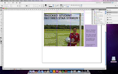

I then placed the image onto photo shop and made a few adjustments. The adjustments that were made was making her skin clearer which i done by creating a new layer then used the quick selection tool and then blurring the skin.
When placing the text on top of the image i placed the text into two columns because Megan is in the third columns. The first columns was fine however the second column went over the football. To solve this problem i texted wrapped the writing. To do this i had to create a new layer and draw a shape around the football so the text went around the football.
When placing the text on top of the image i placed the text into two columns because Megan is in the third columns. The first columns was fine however the second column went over the football. To solve this problem i texted wrapped the writing. To do this i had to create a new layer and draw a shape around the football so the text went around the football.
In post production i found that the negative of not being able to find a net soon became a positive due to the fact that i wanted to put the writing on top of the picture because of the lack of space. This became a positive because if the writing was placed on top of the lines from the net it would become very difficult to read.
Wednesday, 31 October 2012
Jobs
Jobs
Due to the fact that i did not use all of the space of my offer i decide to advertise my jobs pages of my newspaper.
Thursday, 25 October 2012


Tuesday, 2 October 2012
Constructing My Offer
Constructing My Offer
I already created an layer for the back ground of my offer when i thought that i was going to be doing an hairdressing offer therefore all i had to do was change the colour of my background for this i wanted to use an white background.
I went on to the Internet and found a white square and imported the image, then i placed the image on the offer background to make the background white.

I then divided the page into the three sections over the four columns on the first column and a quarter of the second i am going to place some large text to make it know to the readers that it is an offer. I have chosen to use the phase 'Your chance to win!' because most of the offers from my research had the word win but often had a little sentence before to enable to connect with the offer. I have gone for your chance to win because of the word 'your' is directing the phase at the reader.
When putting the text on I noticed that the text was starting on the left hand side however when looking at it i felt that the writing didn't look right therefore i centred the text and it made the text you more informal. I then had to decide the text to use for this phase i wanted the text to look modern so i chosen to use a round font.

After looking at my large font i felt as if the phase would not be bold enough to draw people's attention into the offer. I then investigated further into newspaper offers and found that after their phase they put an exclamation mark.I felt that the exclamation mark shows some enthusiasm in to the offer and makes the offer more dramatic.

I went on to the Internet and found a white square and imported the image, then i placed the image on the offer background to make the background white.

I then divided the page into the three sections over the four columns on the first column and a quarter of the second i am going to place some large text to make it know to the readers that it is an offer. I have chosen to use the phase 'Your chance to win!' because most of the offers from my research had the word win but often had a little sentence before to enable to connect with the offer. I have gone for your chance to win because of the word 'your' is directing the phase at the reader.
Slogan
When putting the text on I noticed that the text was starting on the left hand side however when looking at it i felt that the writing didn't look right therefore i centred the text and it made the text you more informal. I then had to decide the text to use for this phase i wanted the text to look modern so i chosen to use a round font.


Small text
From investigating offers i have found that they normally advertise the price of the product that they are giving away this is to make the offer sound even better and remind the reader that actually they may not be able to afford it with out the offer hoping that they will be more likely to enter.
Image
Planning My New Offer
Planning My New Offer
After changing my offer to the advert i had to come up with a new offer,i went back through my research and looked at some of the offers i saw. I noticed that all the products they were giving away for the price were new that year and some had not even been released yet.
I done a thought shower of the latest products that had come out in 2012 and found that their is a large variety of products and some would not be the right product for a local magazine. From my thought shower i found that they product i wanted to use had to be something my target audience would buy as a large purchase not on their everyday lives otherwise i believe it would not get as much interest.
Due to the fact that my newspaper is going to be a local newspaper to Portishead i thought it would be interesting to see what product they would like to win. I have come up with 5 products i think would be suitable for my newspaper and i am going to give them the products and ask the to circle the one they would prefer (car, smart phones, laptop, 3D television and radio) after then i asked the open question of why.
From my research i discovered that their is two clear winners a car and a smart phone. While analysing the data qualitative data i found that these were the most popular because they are products that are a necessity in the 21st century however their is different brands of these products at different price ranges so my sample thought they could be used regularly but it would be nice to have an product that would normally be out of their price range.
GRAPH
Also while going through the qualitative data i discovered that their was a large difference in the product of choice depending on the life stage the individual is currently going through. I found that if the individual was in late adulthood plus (17 +) then they would choose a car because it is very relevant to their lives and is one of their largest outflows of cash. If the individual was under 17 then driving did not appeal to them because they were legally unable to do it however they felt that the phone you had showed the level of income you had and therefore felt that the better phone they have the better they would look in front of their friends.
Due to the fact that the average reader is going to be older than 17 i decided that i am going to be doing an offer on a new car. I looked at the possible cars i could and decide to use a small family car because it will apply to more of the readers therefore i am going to use a new ford KA.
Image Of KA
Thursday, 27 September 2012
Readership Of Local Newspapers
Readership Of Local Newspapers
Readership is the total number of primary readers of a publication, this is a key measurement of a sucess of a newspappers. As the populatrity of newspapers have reduced over time due to other technology i would aspect to find the readerrship figures to also fall.
Readership Figures
The Daily Mail in June and December 2011 on average had an readership appoximatley of 4.371 million which sound alot however the Audit Bureau Readership figures shows and decrease of 1.82% each year.
The Nottingham Post in 2012 has a weekley readership of 329,512 compared to its readership it 2009 515,344 is a slight decline that if contines could be bad news for the newspaper.
Subscribe to:
Posts (Atom)